© Made in Amsterdam with  2025 / KVK 87603918
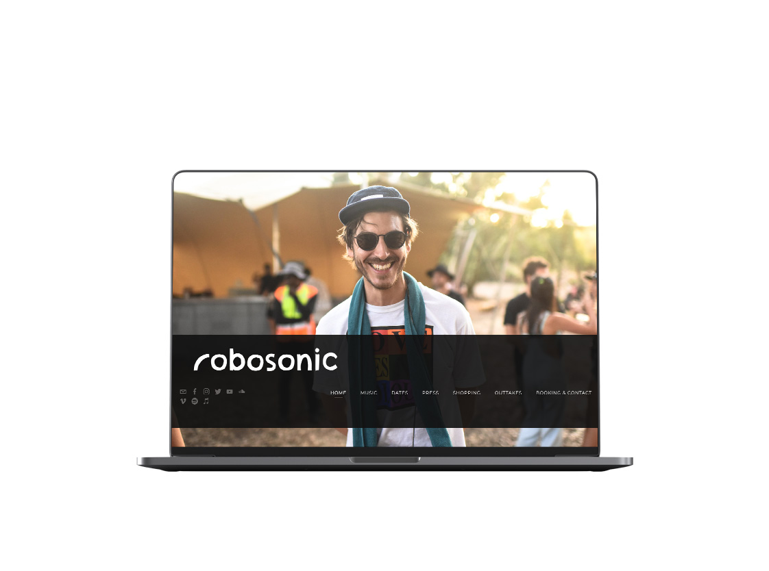
Robosonic Mini-branding
Robosonic Brand ID

Robosonic Brand ID

Robosonic Brand ID

Robosonic Brand ID

Robosonic Brand ID

Robosonic Brand ID

Robosonic Brand ID

Robosonic Brand ID

Robosonic Brand ID

Robosonic Brand ID

Robosonic Brand ID

Robosonic Brand ID

Robosonic Brand ID

About This Project
Having become an authority in recent years, Robosonic set his new commercial strategy redefining and creating a unique identity to set boundaries for the next decade and beyond.
Having the privilege of working for/with Cord, I’ve put together a set of concepts that describe Rocosonic’s sound progression.
I wanted to find relevant concepts for the musician and his need to be identified quick and easy without entering into stereotypes or cliches.
After analyzing the brand’s story and its clear intention to connect and inspire, I’ve come with a playful concept of union and multiculturality expressed in the simplicity of the rainbow, which has a strong meaning in the dance music scene.
From that point, I did a kick sketch of de r of robosonic coming from that rainbow and after the full logo retouched in hand-drawn style to complement this proposal.
After a few discussions, we give life to this final piece and a whole strategy to rebrand all marketing pieces and develop creative ways of presenting new work and upcoming releases while speaking with an audience eager for new content and exciting music.
The result was very satisfactory; we are structuring all communication types and getting ready for the post-covid decade’s strategy, communicating the message clearly and keeping with the mission to inspire people.
Services:
Brand identity, Brand design, Digital design, Social content, Motion content.
Client:
Robosonic Music
Agency:
Punchi, Outakes.
